mono

design system
Buttons Form Elements Lists Tables Alert Banner Select Tabs

Decent defaults

Mono is a lightweight design system to quickly integrate any web project. The main inspiration comes from Element.

Layout

Two-dimensional (rows and columns) layouts are made with Grid.

The first-level blocks are <header>, <nav>, <section>, <footer>. On wide screens, elements such as tables and images can be wider than the rest.

Components

Titles are serif, text is sans-serif.

Available links are underlined and glow when hovered.

Color

Mono relies heavily on one hue at a time, yet there are so many hues to choose from!

Each hue has 4 luminosities: pale, light, vibrant and dark.

Forms are in the complementary color. Where needed black&white is also available (for dimmed elements like less important links)

Browser color mode

Light and dark for text should only be used in combination with one another.

Over the rainbow

hue: 10 pale on dark dark on pale pale light vibrant dark
hue: 30 pale on dark dark on pale pale light vibrant dark
hue: 50 pale on dark dark on pale pale light vibrant dark
hue: 70 pale on dark dark on pale pale light vibrant dark
hue: 90 pale on dark dark on pale pale light vibrant dark
hue: 110 pale on dark dark on pale pale light vibrant dark
hue: 130 pale on dark dark on pale pale light vibrant dark
hue: 150 pale on dark dark on pale pale light vibrant dark
hue: 170 pale on dark dark on pale pale light vibrant dark
hue: 190 pale on dark dark on pale pale light vibrant dark
hue: 210 pale on dark dark on pale pale light vibrant dark
hue: 230 pale on dark dark on pale pale light vibrant dark
hue: 250 pale on dark dark on pale pale light vibrant dark
hue: 270 pale on dark dark on pale pale light vibrant dark
hue: 290 pale on dark dark on pale pale light vibrant dark
hue: 310 pale on dark dark on pale pale light vibrant dark
hue: 330 pale on dark dark on pale pale light vibrant dark
hue: 350 pale on dark dark on pale pale light vibrant dark
black&white pale on dark dark on pale pale light vibrant dark

Examples

Grid Column 1

Inspired by ungrid, Element CSS wires up custom element <g-row> to be a row and <g-col> to be a column. It's an easy, auto-sized, responsive grid that Just Works, and supports the upcoming HTML5 custom elements spec.

Grid Column 2

I've had twelve years to think about it. And if I had it to do over again, I would have grabbed the phaser and pointed it at you instead of them.

<h3>Column</h3> <p>I'm the first column!</p> <h3>Another Column</h3> <p>I'm the second column!</p> <h3>Smaller</h3> <p>I'm grid 3, but a lot smaller than the others.</p>

Headers

<h1>H1 Header: a long, very long, so very very long header</h1> <h2>H2 Header</h2> <h3>H3 Header</h3> <h4>H4 Header</h4> <h5>H5 Header</h5>

H1 Header: a long, very long, so very very long header

H2 Header

H3 Header

H4 Header

H5 Header

Headers

H1 Header

H2 Header

H3 Header

H4 Header

H5 Header

Images

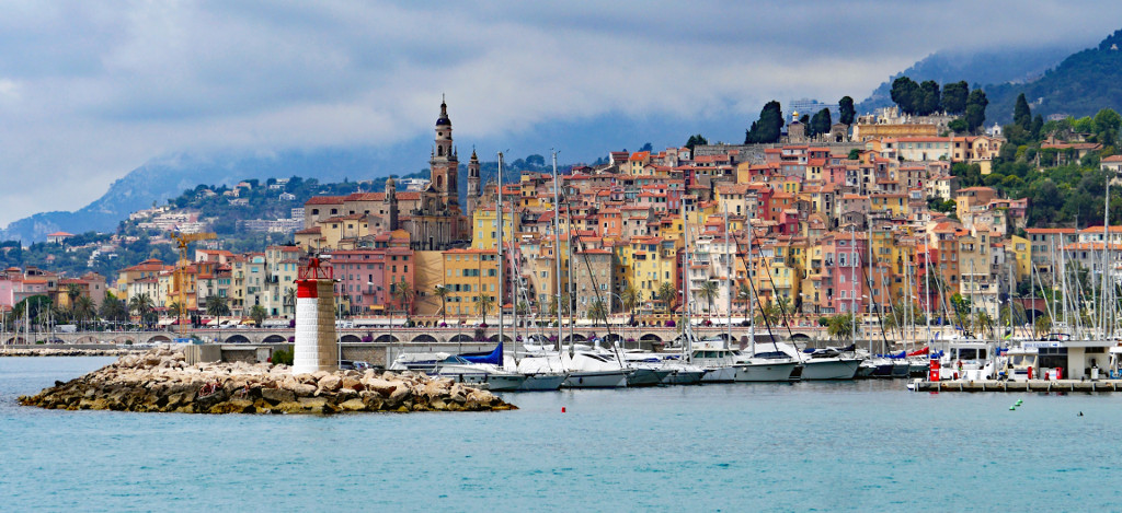
Oversized images are auto-resized to fit the column:
Ordered List

  1. Blue blue blue blue blue blue
  2. Green
  3. Red
  4. Green
  5. Red
  6. Green
  7. Red

Unordered List

  • Green
  • Blue:
    • Pale Blue
    • Medium Blue
    • Dark Blue
  • Part 2:
    1. Blue blue blue blue blue blue
    2. Green
    3. Red
    4. Green
    5. Red
  • Red

Table

Name Instrument
Data Violin
Riker Trombone

Code

<code> elements used in a <p> will be inline-block: echo('hello world!'). Code tags outside of a <p> will be blocks.

Forms

Choose your favorite monster

Full CSS code

The code currently used on this page: